Analysis of the 2017 Thomas Fire

This project’s goal is to visually explore the region affected by the Thomas Fire across Ventura and Santa Barbara counties in 2017.
Python
MEDS
Spatial-Analysis
Quarto
Author
Affiliation
Published

December 4, 2024

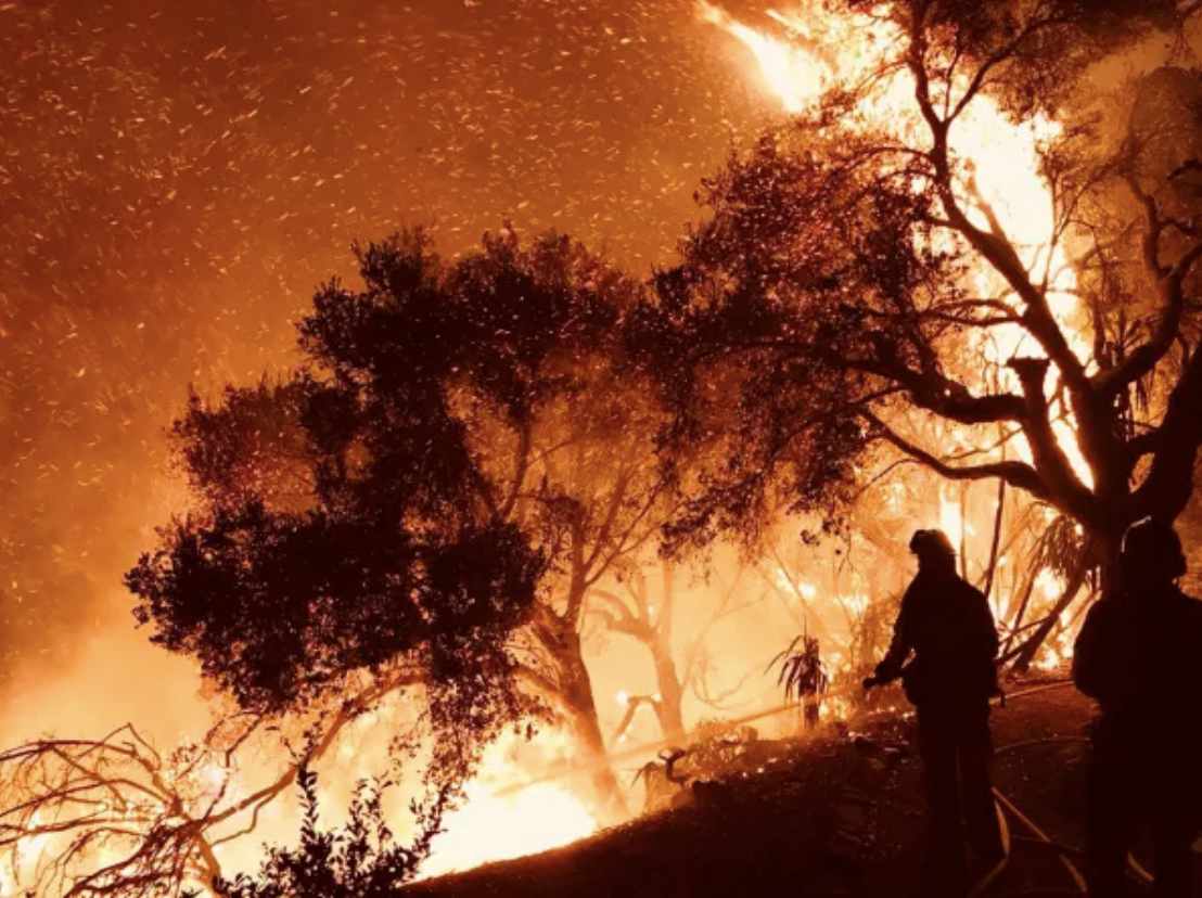
An image of firefighters battling the fire as it encroaches on Carpinteria on December 10. Credits: Mike Eliason/Santa Barbara County Fire Department via AP

Thomas Fire Analysis

Author: Kimberlee Wong

Link to Website

Link to Repository

About

Purpose

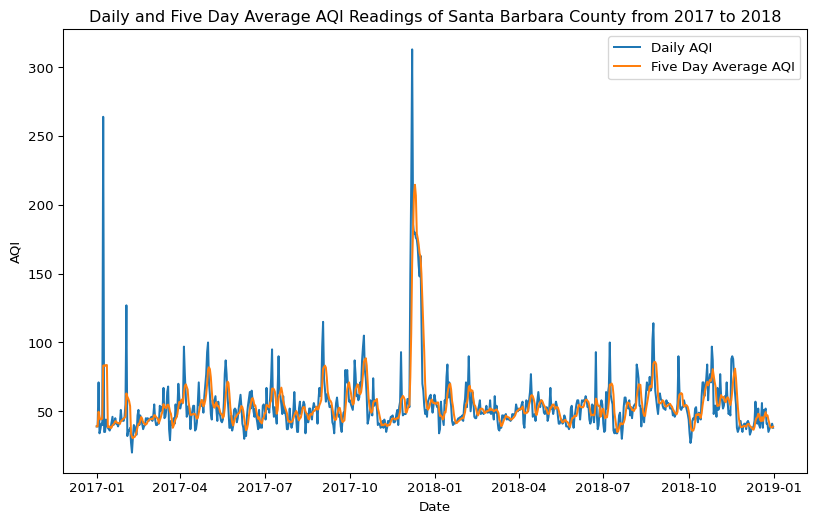
In December of 2017, multiple wildfires ignited in Southern California, and was dubbed the Thomas Fire. It took months for it to be considered completely out, and at the time, it became the seventh most destructive fire in California history. The following analysis was done in two-fold. Its purpose is to get a better understanding of the 2017 Thomas Fire effects. The first part shows the process of producing a graph that shows how the average air quality was affected, and the second part visualizes the region of fire through a false imagery map.

Highlights

  • Clean and Manipulate: Clean column names and remove unnecessary column names for ease.
  • Visualize: Produce both true and false image color image maps. Produce a graph showing the average air quality index before, through, and after the Thomas Fire.
  • Geospatial Analysis: Use rioxr to import the landsat data and access its attributes. Use squeeze and drop.vars to remove unnecessary bands and coordinates.

About the Data

The Landsat data comes from Microsoft Planetary Computer Data Catalogue, and it is a simplified collection of colored bands. It was processed to remove data outside land and coarsen the spatial resolution.

The Thomas Fire boundary was created by filtering a California Fire perimeter file available from the US Government Data Catalogue.

The AQI (Air Quality Index) data was created by the US EPA (Environmental Protection Agency), and was filtered down to Santa Barbara County.

Import Libraries

Show code
import pandas as pd
import geopandas as gpd
import os
import matplotlib.pyplot as plt
import rioxarray as rioxr
from shapely.geometry import box  # To create polygon bounding box

pd.set_option("display.max.columns", None) # To see all columns
Load Data

# 2017 and 2018 AQI Data # 

aqi_17 = pd.read_csv('data/daily_aqi_by_county_2017.zip', compression = 'zip')
aqi_18 = pd.read_csv('data/daily_aqi_by_county_2018.zip', compression = 'zip')

# Landsat Data # 

# Make a root path
root = os.path.join('/',
                  'Users',
                  'kimmywong',
                  'Downloads',
                  'MEDS',
                  'EDS_296',
                  'kimberleewong.github.io',
                  'posts',
                  'thomas_fire_analysis',
                  'data')
                  

# Make a filepath
fp = os.path.join(root,
                 'landsat8-2018-01-26-sb-simplified.nc')

# Use both root and file paths to import the Landsat file
landsat = rioxr.open_rasterio(fp)

# Thomas Fire Boundary #
thomas_fire_boundary = gpd.read_file(os.path.join('data', 'thomas_fire_boundary.shp'))

Santa Barbara AQI Analysis

Data Cleaning and Manipulation

# Combine 2017 and 2018 data into one dataframe
aqi = pd.concat([aqi_17, aqi_18])

# Clean column names
aqi.columns = (aqi.columns
                  .str.lower()
                  .str.replace(' ','_')
                )
# Select for Santa Barbara county and remove unneccessary columns
aqi_sb = aqi[aqi['county_name'] == 'Santa Barbara'].drop(columns = ['state_name', 'county_name', 'state_code', 'county_code'])

# Convert date to datetime object
aqi_sb.date = pd.to_datetime(aqi_sb.date)

# Change the index to the data
aqi_sb = aqi_sb.set_index('date')

# Calculate AQI rolling average over 5 days
aqi_sb['five_day_average'] = aqi_sb.rolling('5D').aqi.mean()   

Visualize AQI

Show code
# Set figure size
fig, ax = plt.subplots(figsize=(10, 6))

ax.plot(aqi_sb.index, aqi_sb.aqi, label='Daily AQI')
ax.plot(aqi_sb.index, aqi_sb.five_day_average, label='Five Day Average AQI')
ax.set_xlabel('Date')
ax.set_ylabel('AQI')
ax.set_title('Daily and Five Day Average AQI Readings of Santa Barbara County from 2017 to 2018')
ax.legend()

Thomas Fire False Color Imagery Map

Data Cleaning and Manipulation

# Remove length 1 dimensions (band)
landsat = landsat.squeeze()

# Remove coordinates associated to band dimension
landsat = landsat.drop_vars('band')

# Check that it worked
print(landsat.dims, landsat.coords)
FrozenMappingWarningOnValuesAccess({'x': 870, 'y': 731}) Coordinates:
  * x            (x) float64 7kB 1.213e+05 1.216e+05 ... 3.557e+05 3.559e+05
  * y            (y) float64 6kB 3.952e+06 3.952e+06 ... 3.756e+06 3.755e+06
    spatial_ref  int64 8B 0

True Color Image

# Visualize the red, green, blue variables
landsat[['red', 'green', 'blue']].to_array().plot.imshow()
Clipping input data to the valid range for imshow with RGB data ([0..1] for floats or [0..255] for integers). Got range [0.0..54930.71604938272].

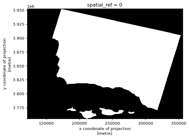
This first attempt at visualizing the Landsat data didn’t work quite right because it is showing up in black and white. Let’s change the robust parameter to account for the clouds’ RGB outlier values throwing off the plot.

# Visualize the red, green, blue variables and adjust robust parameter 
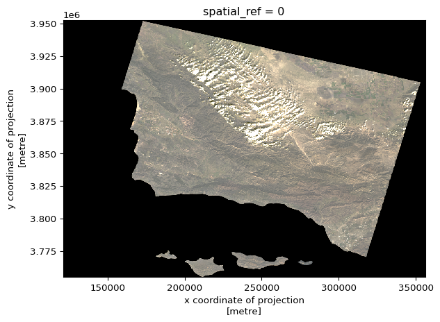
landsat[['red', 'green', 'blue']].to_array().plot.imshow(robust = True)

The first attempt showed up in black and white. By just changing the one parameter of robust, the plot now shows a true color image. The robust parameter essentially changed the colormap range so that the extremes aren’t included. Because the clouds were affecting our first map, turning on robust changes that.

False Color Image

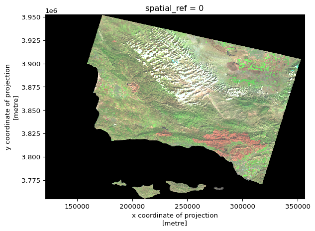
Instead of using the usual RGB (red, green, blue) colors, let’s switch them to make a false color image and better visualize the area that was affected by the fire. In our specific case, we will be using short-wave infrared(swir22) instead of red, near-infrared(nir08) instead of green, and red instead of blue. We must input the exchange in the order of RGB in order to get the desired effect.

# Visualize the swir22, nir, red variables and keep robust = True
landsat[['swir22', 'nir08', 'red']].to_array().plot.imshow(robust = True)

False Color Image Map

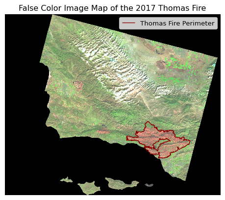
Create a map using the false color image that was made above and the Thomas fire perimeter.

CRS Manipulation

Because we’re combining two geodata files, we must ensure the CRSs match.

# View each CRS
print('Thomas Fire CRS: ', thomas_fire_boundary.crs)
print('Landsat CRS: ', landsat.rio.crs)
Thomas Fire CRS:  EPSG:3857
Landsat CRS:  EPSG:32611
# Change Thomas Fire boundary to match the Landsat CRS 
thomas_fire_boundary = thomas_fire_boundary.to_crs(landsat.rio.crs)

# Add a check to make sure it worked 
assert thomas_fire_boundary.crs == landsat.rio.crs

Plot Map

Show code
# Required to put the figures on one map
fig, ax = plt. subplots() 

# Plot the false color image as it was earlier
landsat[['swir22', 'nir08', 'red']].to_array().plot.imshow(robust = True, ax = ax)

# Plot the Thomas Fire perimeter(only)
thomas_fire_boundary.boundary.plot(ax=ax, edgecolor = "darkred", linewidth = 1, label = "Thomas Fire Perimeter")

# Add legend
ax.legend(loc='upper right')

# Turn off the axes
plt.axis(False)

# Add Title
plt.title("False Color Image Map of the 2017 Thomas Fire")

# Gets rid of the text that shows up over the map of the annotation
plt.show()

Figure Description: This is a map of Santa Barbara County in the year 2017. It features a layer on top of it that shows the border of the Thomas Fire. This map uses false color imagery (occurs when you replace the original RGB colors with other ones of your choosing. In this instance, instead of red we used short-wave infrared(swir22), instead of green we used near-infrared(nir08), and instead of blue we used red. By doing this, the map clearly shows where the Thomas Fire is. When comparing it to the true color image, you cannot really tell that the region of the Thomas Fire was different. The included border also helps to distinct the fire from the rest of the county.

References

Microsoft Planetary Computer Data Catalogue, Landsat collection 2 Level-2 [Data file] Available from: https://planetarycomputer.microsoft.com/dataset/landsat-c2-l2. Access date: November, 2024.

Data.gov Data Catalogue, California Fire Perimeters (all) [Data file] Available from: https://catalog.data.gov/dataset/california-fire-perimeters-all-b3436. Access date: November, 2024.

AQI Data: https://aqs.epa.gov/aqsweb/airdata (Accessed October, 2024)

Citation

BibTeX citation:
@online{wong2024,
  author = {Wong, Kimmy},
  title = {Analysis of the 2017 {Thomas} {Fire}},
  date = {2024-12-04},
  url = {https://kimberleewong.github.io/posts/thomas_fire_analysis/thomas-fire-blog.html},
  langid = {en}
}
For attribution, please cite this work as:
Wong, Kimmy. 2024. “Analysis of the 2017 Thomas Fire.” December 4, 2024. https://kimberleewong.github.io/posts/thomas_fire_analysis/thomas-fire-blog.html.